Paula Scher, Helvetica and type that shouts.
 By Nick Ridley ·
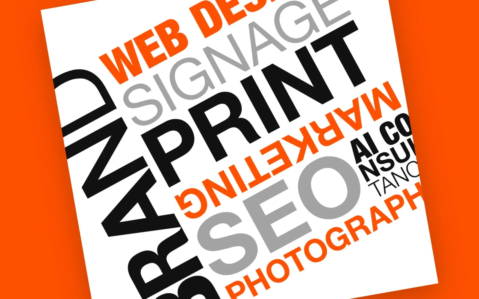
If you’ve looked at our homepage this week, you’ll have seen a little white card tilted over my shoulder. BRAND running up the side. MARKETING upside down. PHOTOGRAPHY falling off the edge.
That card exists because of one designer. Paula Scher.
I want to talk about her for a minute. Not because you need to know design history to run a business. Because she proves something every business owner should hear: type isn’t just there to be read. It can be the whole picture.
Who she is
Scher has been a partner at Pentagram in New York since 1991. Before that she designed record sleeves, at one point turning out well over a hundred album covers a year at Atlantic Records. She has since done identities for everyone from Citi to Microsoft Windows.
But the work most designers fall in love with is her identity for The Public Theater in New York, which she started in 1994.
The posters that changed theatre marketing
Theatre posters used to look like theatre posters. A photo of an actor looking moody. A title in something elegant. A quote from a critic.
Scher went the other way. She took her cue from the street: fly posters, old Victorian playbills and chunky wood type. Big, mismatched letters, stacked and jammed together. Photos cut out and dropped in. Two or three flat colours. The posters for Bring in ‘da Noise, Bring in ‘da Funk in 1995 are the famous ones. You don’t read them so much as hear them.
The words are the image. Nobody needed a photo to understand the show was loud.
Then she did it to a building
Posters are one thing. In the early 2000s Scher took the same idea to a whole building. The Lucent Technologies Center for Arts Education, a school linked to the New Jersey Performing Arts Center, moved into the old Cathedral House in Newark: a gloomy 1940s red-brick rectory with battlements.
She painted it white and covered it in words. DANCE. MUSIC. DRAMA. THEATER. POETRY. WRITING. Up the walls, round the windows, along the parapet. The building stopped looking like a church office and started telling you exactly what happens inside.
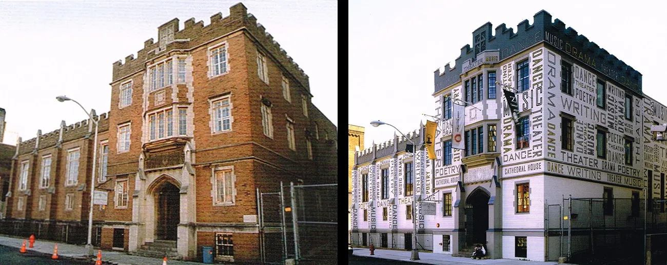
Cathedral House, Newark, before and after. Environmental graphics by Paula Scher, Pentagram. Image © Paula Scher / Pentagram.
That’s the most extreme version of the lesson, and the most useful one for a high street business. Your building is a sign. Your van is a sign. If they don’t say what you do, they’re wasting the most expensive bit of marketing you own.
The bit I love
Here’s the twist. Scher isn’t a fan of Helvetica. She said as much in the 2007 documentary Helvetica.
Our new website is built entirely in Helvetica.
I don’t think that’s a contradiction. Helvetica and the Swiss school give you order. Clean grids, clear hierarchy, nothing shouting for the sake of it. Scher gives you volume. The best work knows when to use which.
She has a line I come back to all the time:
“Less is more and more is more. It’s the middle that’s not a good place.”
That’s the lesson. Not “be minimal” or “be loud”. Be one or the other, on purpose. The safe middle is where brands go to be forgotten.
A second and 34 years
The Citi logo started as a quick sketch Scher drew in the very first meeting. The story has grown a bit in the retelling, the way the old Picasso napkin tale has. But in a short film by Hillman Curtis she puts it in her own words. The logo, she says, was “done in a second and 34 years.”
The second is the drawing. The 34 years are everything she’d learned before she picked up the pen.
Every small business owner who has ever wondered why a logo costs what it does should keep that one in their back pocket.
What you can steal from her (without copying her)
You don’t need a Broadway budget to borrow the thinking.
- Let the type do the work. If you haven’t got a great photo, a great headline set big and bold can carry a whole poster, flyer or social post.
- Pick a side. Calm and spacious, or loud and packed. Decide which you are and commit. Half-and-half reads as “didn’t decide”.
- Look at the street. Old shop signs, market stall boards, hand-painted vans. Colchester is full of brilliant, accidental typography. Take photos of it.
- Crop it. Words don’t have to fit politely inside the box. Letting them run off the edge makes people’s eyes finish the job, and that’s attention you didn’t have to pay for.
- Borrow the vocabulary, not the sentence. Scher studied constructivism and Victorian wood type, then made something that was clearly her own. Inspiration is learning the language. Copying is reciting someone else’s poem.
That vocabulary is easy to see in the source material. This is El Lissitzky’s Beat the Whites with the Red Wedge, from 1919. A red triangle driving into a white circle. Type set at angles, scattered across the page, doing as much work as the shapes. A hundred years on, it still looks like it was made last week.
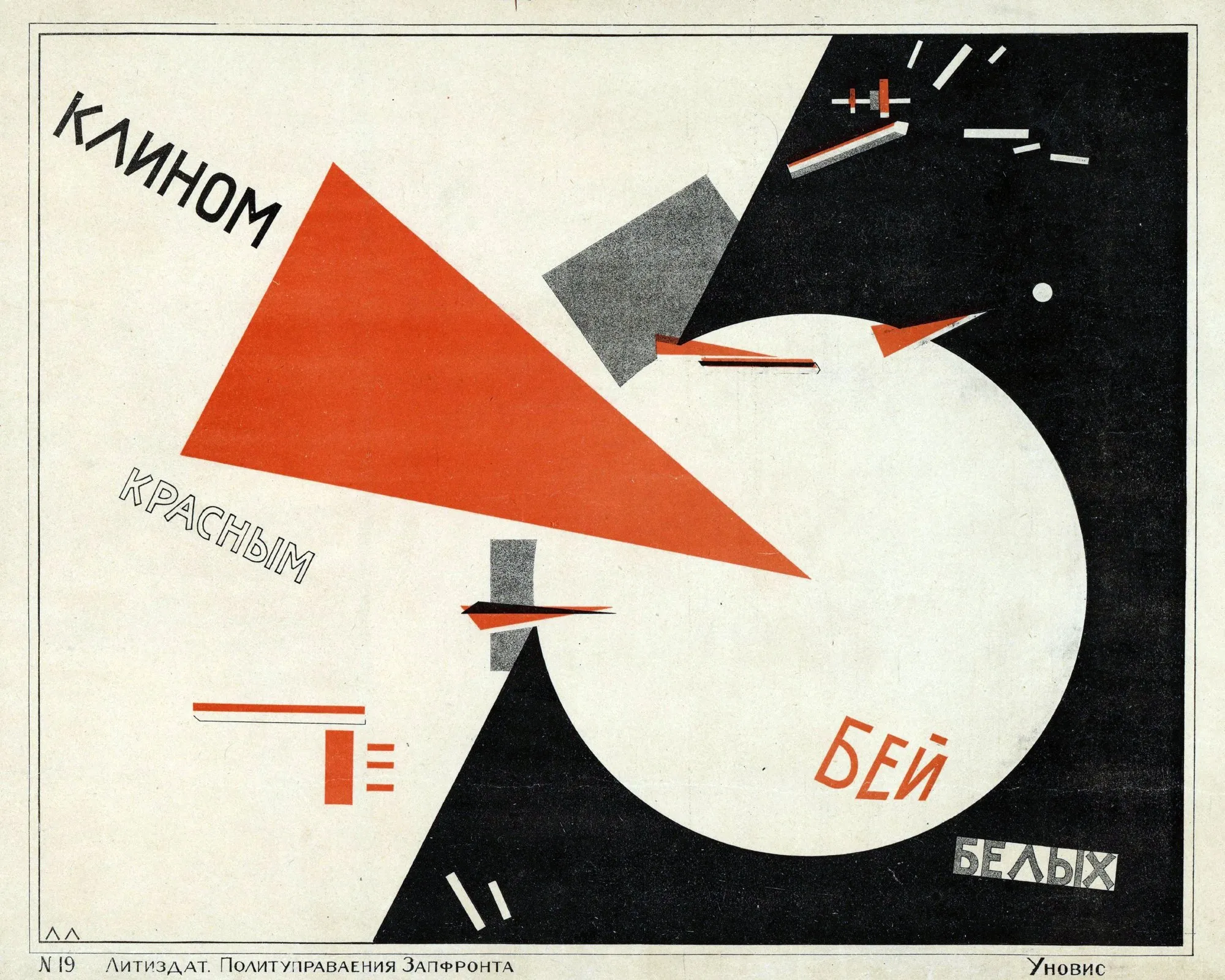
El Lissitzky, Beat the Whites with the Red Wedge, 1919. Public domain.
Why it matters
Most small business marketing is set in whatever font came with the template, at whatever size fits. It’s fine. It’s also invisible.
Typography is the cheapest way to make your brand feel like somebody actually meant it. Same words, same message, set with a bit of nerve.
So go and have a look at Paula Scher’s work. Spend twenty minutes on it. Then look at your own flyer, website or van and ask the question she would: is this loud enough to be heard, or calm enough to be trusted? Or is it stuck in the middle?
If it’s the middle, come and have a chat. We like a bit of noise.
We help small businesses across Colchester and Essex with brand, web design, photography and marketing. Let's talk.